Thursday, May 7, 2015

My portfolio!

This is my portfolio filled with all my digital artwork from the past semester. Inside you will see I have worked with Adobe Illustrator, Adobe Photoshop, HTML 5, and InDesign. Even though this is a beginning digital arts class, I learned a lot that will help me in the future. I was familiar with photoshop but this class taught me how to utilize it for video. Illustrator was a little difficult at first, but quickly enjoyed the projects I made with it. I can't wait to use my skills in the future to help others create their ideas.




Monday, April 27, 2015

Animation


Animation
My animation project is an advertisement for my brand "I like 2." I used three hobbies to ask the question "what do you like 2 do?" and at the end featured my product.


Monday, April 20, 2015

Anamatic


My animatic is a simple look at what I plan on doing with my animation project. I plan on doing stop motion portraying the different things 2 do, like surd, paint, dance and so forth. I  also plan on tweaking the opening and closing slides.

Tuesday, April 7, 2015

Lyrical Collage

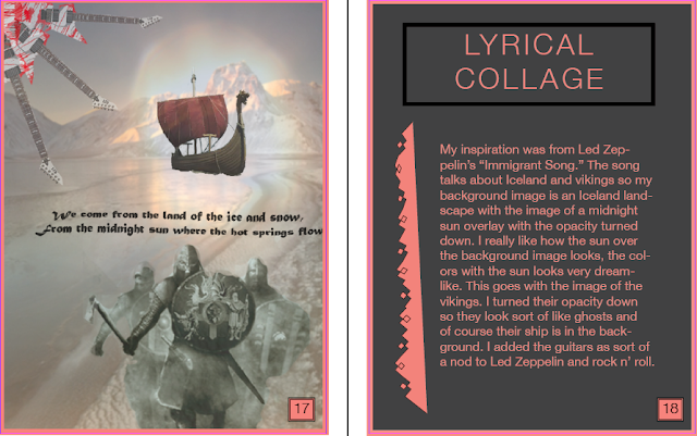
Okay so my inspiration was from Led Zeppelin's "Immigrant Song." The song talks about Iceland and vikings so my background image is an Iceland landscape with the image of a midnight sun overlay with the opacity turned down. I really like how the sun over the background image looks, the colors with the sun looks very dreamlike. This goes with the image of the vikings. I turned their opacity down so they look sort of like ghosts and of course their ship is in the back of them. I added the guitars as sort of a nod to Led Zeppelin and rock n' roll.


Sunday, April 5, 2015

Tardis in the Clouds
I used the brush tool to fill in the tardis and to create the stars and clouds. I gradually lightened the opacity on the clouds as they got higher. I used the draw tool to make the tardis and the stairs in the clouds. I filled the entire background before the rest of the image.


Tuesday, March 31, 2015

Magazine Cover

So I created "UFlorida Chomp" which is a campus gossip magazine with the focus on a recent game at the football stadium. I enhanced the background picture and the tailgate picture to make the color pop. Then I faded the background so it was easier to read text. The text uses bevel for the inside effect. The bottom 3 pictures I used the selection tool to select just the person so they would pop out more and I like this effect. I added some orange and blue borders around the top right pictures. Overall this was a fun project.